I usually take some pictures of the miniatures as I finish them and post them up to Facebook. My normal approach is to drop a heavy white piece of paper behind them, drop my painting lamp close to the mini, and then take some shots. The white balance is almost always wrong, and as I have written about before, I will use a tool like Snapseed to adjust the white balance and brightness. The result tends to be a photograph that looks good, but the colors are not always true. I have seen some instructions on how to build a lightbox, but I don't have the table space to keep something intricate set up all the time. I searched online a bit and ended up ordering one for about $12 from Amazon. It is collapsible and has a built-in LED light, with black or white backdrops. Here's what it looks like on my rather messy desk (to be cleaned over Spring Break, for real this time).

Here are two images of one of the new batch of villains, the first taken in my usual approach and the second in the lightbox.


As you can see, the old approach looks positively yellow by comparison. The colors on the bottom one are much more "true," meaning that what I see here looks a lot like the critters beside me on my desk. Without the intense painting lamp pulled in front of them, the fronts of the minis are a bit shaded, but again, they do look authentic at least. So, for the rest of this post, I'm going to use the lightbox images. I will continue to tinker with the lights around the lightbox to see if I can improve the photos further.
For this whole set, like the Myth monsters, I was going for speed. I wanted them to look nice of course, but I didn't want to spend inordinate time on them. I have been inspired lately by Sorastro's painting (who isn't?): he usually uses a simple formula of base color, wash, highlight, but he does it with such grace that it looks amazing at the end. I didn't do this for each figure, but the spirit is there.
 |
| A goblin archer |
 |
| A gaggle of goblins |
The goblin archers were not very inspiring. I found the sculpt to be rather poor. For example, the arrow is not separate from the chest: it's extruded back. This can be hidden with clever paint, but combined with the featureless limbs and helmet, they were just kind of dull. Starting with these made me reflect on how Descent was a precursor, or perhaps a herald, of the miniature gaming renaissance. Now, there are more miniature-heavy board games on Kickstarter than anybody has time and money for, and they all look amazing. I bet if Fantasy Flight released a third edition of Descent, it would pick up on this trend, since they understand the market and have the pockets for it. However, Descent is an entire ecosystem, and as I understand it, the cooperative mode app has really helped their sales. It would be folly to jump to a third edition right away, with all the money that people continue to invest in this series.
Each monster group had one that was cast in red, to represent a leader unit of some kind. I haven't carefully read the rules, but folks tell me it's important that this one be visually distinct from the rest. I thought it would be fun to incorporate some red into one of the models, so here, we can see that one goblin has a red loincloth, where the others are grey.
One of the things that this new photography setup tells me is that I should really take those highlights even higher. Like I said, they really do look like this on the table, but they should probably be brighter. It's something I continue to work on. It might be a side-effect of the fact that I paint under a very bright light, or maybe I just need to keep the "more contrast" mantra in mind.
 |
| Standard spider |
 |
| Marked spider |
 |
| A squad of spiders |
I'll mention here that I'm doing some very simple basing on these miniatures. I used my usual mix of model train ballast, about 8:4:1 fine, medium, and coarse. This is painted black, which always takes more than one coat to get into the nooks and crannies. Drybrush this with brown craft paints for a generic earthy surface. I'm using a 50/50 mix of green and black tea leaves from bagged teas as flock to give some organic material.
 |
| A zombie |
 |
| A zumba of zombies |
Another quick-and-sufficient paint job here. I'm not sure why the first picture has such poor lighting but the other one looks more lit. It may have to do with where I placed the figure in the lightbox; this will require further experimentation. Clearly, this is a quick two-color paint job: base, wash, highlight. I spent a little more time with the highlighting here, and I think it helps. The sculpt is actually not so bad here, and they could have been given more character with more time (and, of course, a desire to spend more time on them).
 |
| A flesh moulder |
 |
| A falafel of flesh moulders |
I'll level with you, I have no idea what a "flesh moulder" is. I mean, it's these guys, but I'm still a little shaky on it. I spent a bit more time on these guys, in part because the sculpt required more brush dexterity. This was again a base, wash, highlight job, but I spent more time on it and I think it shows. For minions that exist only to be destroyed, they're pretty good. I copied the color scheme from the card art, so they were all already dressed in red-orange. To set off the captain, I gave him a red magic energy rather than the purple of his underlings. Again, they could have been gussied up with more variety in the colors or detailing on the robes, and when I have nothing else to paint, I could return to them. In the meantime, I'd like to see this game hit the table before the end of the semester.
 |
| A Shadow Dragon |
 |
| Same Shadow Dragon, Different Angle |
 |
| Another, higher-ranking Shadow Dragon |
From here I moved on to some of the larger figures. There are two shadow dragons, which were painted almost identically. The game art shows them having pale green facial details, so I painted on that way and one with a pale orange, to bring in some redness for the captain. I decided to go with shades of grey and black strictly, given that they are shadow dragons. I mixed just a little purple in to add some interest to the tone. I basecoated the whole miniature and then used the large, plain surfaces to practice two-brush blending. It turned out great in some spaces and a little sloppy in others. I decided to keep the spines pitch black; you probably cannot tell from the photos, but the spines are all also gloss varnished, so although it lacks tonal variety, the figure has some visual interest.
This is also the first completed figure in the set where you can see my new basing bricks. This was a trick I learned from Atom Smasher at Tabletop Minions, using a rectangular hole punch on craft foam to get great cinder-block-sized bricks. I love it, especially on these big miniatures, where the bases need a little extra something so they're not just grit and leaves. You can also see that I've added some grass flock here, which is roughly a 50/50 mix of medium green fine turf and burnt grass fine turf. I don't think the grassy spots distract from the model, but they give a little bit more flavor to the base.
 |
| Merriod |
 |
| Merriod |
 |
| More Merriods |
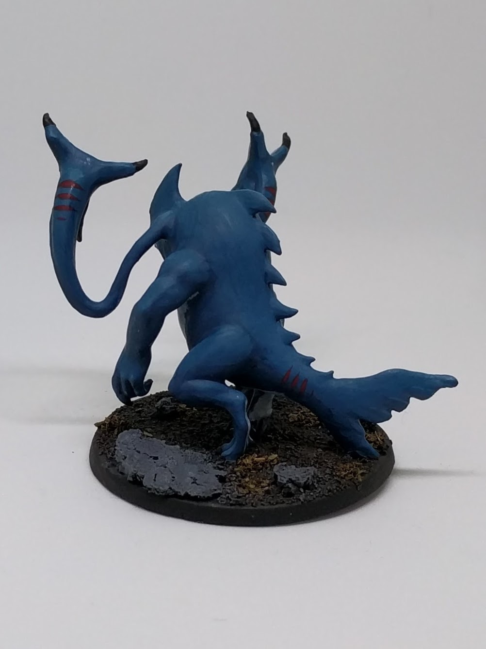
What's a merriod? About three hundred pounds.
These guys are pretty cool, really: some kind of land shark with crazy head tentacles. My brother somehow ended up with a spare one and gave it to one of my sons years ago, and he painted it up in red like a demon, which also worked. I decided to go more with the shark theme and card art. It took me a long time to mix a blue color that I really liked, but after several coats, I ended up with this, which I remember to be a mix of dark blue and green to make an aqua tone, then a bit of orange to bring it down. Although the concept of these miniatures is intriguing, the sculpt is basically an undetailed lump of plastic. I used the opportunity again to practice two-brush blending, and I think it turned out quite nice. The transitions on the chest muscles may be a little stark, but then again, contrast! You can't learn to increase contrast without breaking a few eggs, or some idiom like that.
The higher-ranking of the two has red markings on his tentacles and tail, but like the spider, they don't "pop" so well. I did actually use several layers of paint to make the transition to red more intentional, but it still doesn't really stand out. I think it will be fine at the table, but I think it's a place where I likely needed to go with more intense contrast. I suppose I could even touch that up sometime when painting other things, if it turns out not to stand out at the table well enough.
Once again here, because the figure is hunched over, I think the lighting in the lightbox alone doesn't quite do it justice. Yes, it looks like this on the table, but it's hard to appreciate some of the details.
 |
| An Elemental |
 |
| Same elemental, rear view |
The two elementals were fun to paint, being so different from the rest of the set and quite different from classic D&D-style elementals. The bottom of the mini is supposed to represent water, which I transitions to a more grey shade in the tail to suggest wind. Once I drybrushed to pick out the highlights and washed to bring the tones together, the aqua-grey transition was a bit lost. It's subtle, and I think it's fine, although showing it to others they hadn't noticed it at all. Oh well, we paint for ourselves, right? The fire was fun to paint, though there is a lot of it: I don't have anything else for scale here, but this is a big miniature.
I had finished it up and showed my son or my wife (I don't remember who), and they pointed out how stark the transition was between fire and water. Once they said that, I couldn't un-see it, so that's when I added the fading yellow you can see on the rear view, transitioning down into the water. Previously, the top half was fire and the bottom was water. This is much nicer, really. I don't think I have a good before picture for comparison though.
I couldn't think of any great way to distinguish between the two elementals, so one of them has red bricks on his base. We'll see if that works or not once we get to the table; I can always touch it up later.
 |
| Ettin |
The two ettins were the the last of the large villains from this set, and I had a lot of fun painting them. I slowed down a little bit and gave these guys more time, though still taking shortcuts where prudent. The flesh was done with two-brush blending, and I am really happy with the transitions around the muscles and the bulging belly. The furry areas got a careful drybrush treatment. The only difference between the two ettins is that the rope that one has a red rope holding up his loincloth, and the other has more of a conventional brown rope color there.
 |
| Barghest |
 |
| Barghest |
 |
| Barghest Captain |
 |
| A bevy of barghests |
The last of the monsters is the barghests. Once again using simple techniques, I think these might be the best of the bunch. Base, drybrush, wash for the fur, but with slightly different colors for the mane and body. I also took the highlights up pretty high before toning them down with the wash, giving these more effective highlights than some of the others in the set. The gory side was done with a fleshy base color, more blood-hued wash, and then manual highlights. The bones were painted last. Honestly, some of the bones looked really good when they were just grey primer splattered with bits of paint and wash. Once I painted over them, they looked more stark, and I thought about taking them back to a bloody bone rather than a stripped bone look, but truly, these guys are kind of gross, and I had enough of looking at them.
That's it for the core set villains. I have the heroes all ready to go, and I want to paint enough of them that we can try the game out while I'm painting the others. My brother also bought me a Heroes & Monsters expansion with some great new creatures, so I may move right into that after the heroes.
Tune in next time for the heroes, although you'll probably hear more about story mapping or board games in between. Thanks for reading!
[Edit: Here's a link to Part 2]
[Edit: Here's a link to Part 2]
No comments:
Post a Comment