Lightbringer
First up in the Lightbringer set is family favorite Lil' Ned:
 |
| Lil' Ned |
 |
| Lil' Ned |
The boys have played this character more than any other, in part because he is huge. Ned is at least a head taller than the rest of the figures, and his character skills reflect it: he blocks line of sight for enemy ranged attacks, and his melee actions have an extra zone's range. The boys' favorite part is having Ned play the Bonecrusher class and charge into a room full of minions.
He was a fun figure to paint, and fairly straightforward. I used a variety of techniques... but I didn't write them all down, so memory is a bit fuzzy. I am pleased with how I was able to give a purple cast to his pale skin, matching the card art. In this whole set, I have continued my experiments into wet-blending, which I know I did on the horns, followed by a wash and highlight.
 |
| Myriam |
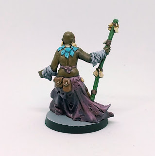 |
| Myriam |
Myriam is one of my favorite characters in the set, in part because she breaks female magic-user stereotypes. She has a thickness to her that expresses strength and power. Her pose expresses this idea too: she will not be moved.
I do not paint a lot of dark-skinned characters, and I always approach the task with a bit of trepidation. Mixing the right color is part of the challenge, but the bigger part is getting the highlights right, since dark skin has as bright highlights as light skin. I ended up using a mix of Flat Earth, Dark Blue, Flat Green, and Flat Flesh to get her base skin tone, and I quite like the result. I probably could have brought some of the highlights up even farther, but I think it's pretty good as it is. The bald head combined with red facepaint was a challenge, since first I painted the whole head, and then added and highlighted the facepaint in a separate step. I happen to have a work-in-progress shot that shows just the flesh alone having been painted:

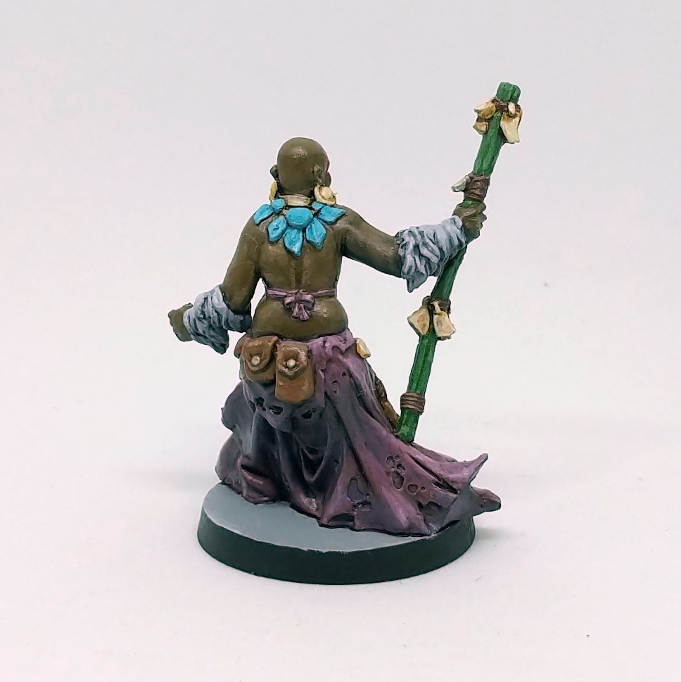
 |
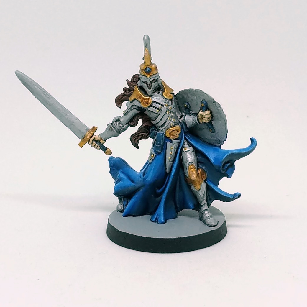
| Sicarius |
 |
| Sicarius |
The biggest challenge here was, of course, the blend from purple to white on the layer beneath his armor. This was another chance to practice some wet-blending, but also to practice visual trickery: the "blended" area is frequently hidden under armor, and so I had to give the illusion that there was a continuous blend even when it was covered. I think it turned out quite nice. The rest of him was pretty standard. I've been mixing my Vallejo Air metallic paints with some nonmetallics (grey, in this case) and applying my P3 Armor Wash for shade, following up with brushed-on highlights. It works fine here.
Sorcerers
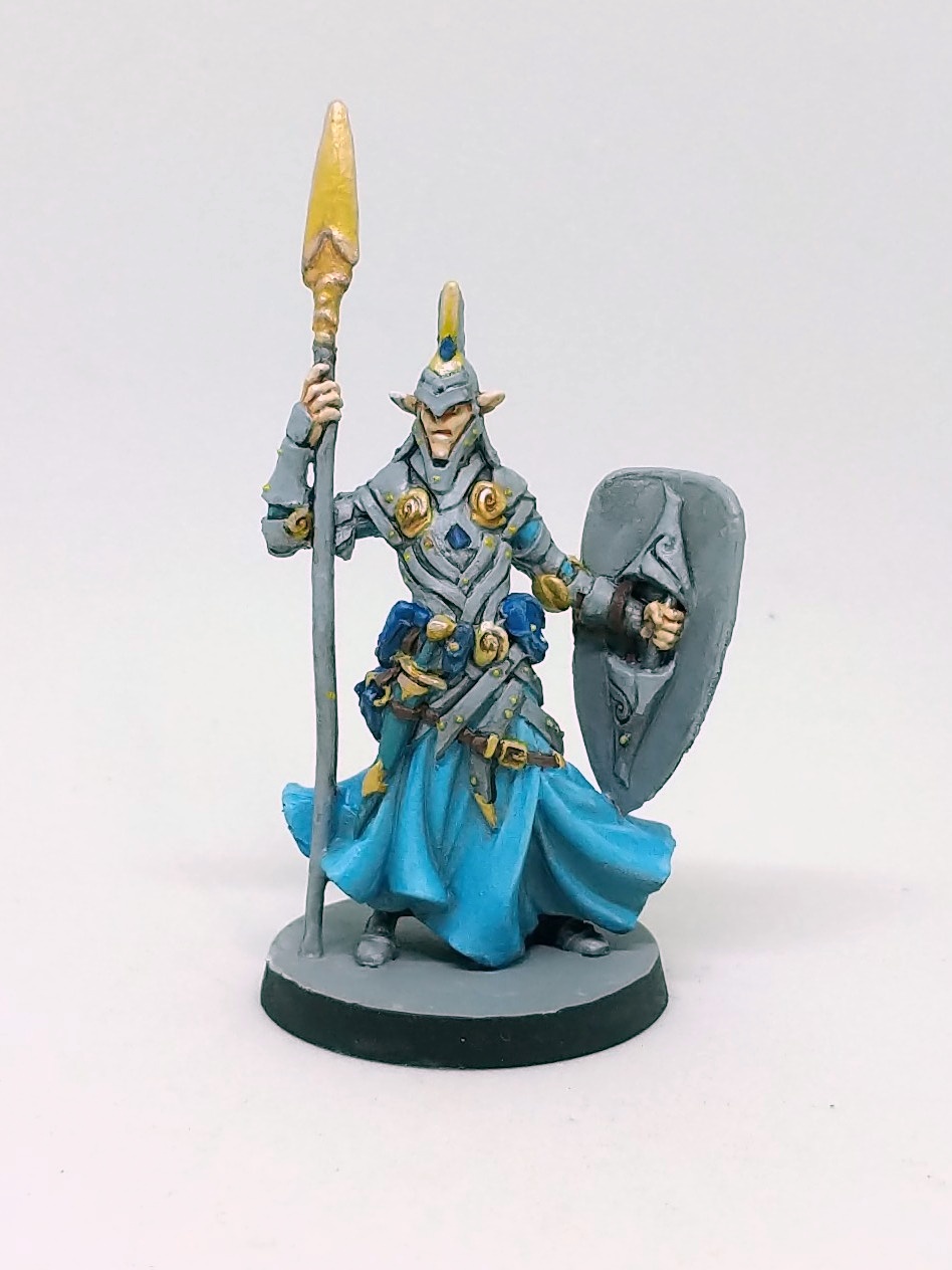 |
| Azrael |
 |
| Azrael |
As with Sicarius, the armor is a blend of metallic and non-metallic. In the highlighting, it got further away from the metallic sheen and looks a little flat, but good enough for tabletop. The gold here is a blend of VMC Gold with ivory and a spot of P3 yellow ink—a slightly different formula than I have used before. As with the steel, I lost some sheen with my highlights using this approach.
Incidentally, Azrael was really wonky out of the box, his spear bent in an almost an "S". It seems he has some kind of scoliosis and needs to hold himself up. After dipping in hot water for a few seconds, I was able to adjust the spear to be nearly straight and then shock it into place with ice water. The weird thing here is that I'm not even sure what else changed. It's not like I plastic, so all that material that was curved up had to go somewhere. It's not clear to me if his arm was drooping or his slouch was exaggerated or what. There's still a bit of a bend in his spear, more visible from the side than from the front or back, but once again, tabletop quality is good enough for us. He's not cool like Lil' Ned after all.
 |
| Whisper |
 |
| Whisper |
Whisper was one where I thought, "Maybe I need one more highlight," so I went back to her while working on another character to add a little more pop. I took pictures before and after, but you cannot really see a difference. It's still not clear to me if it just didn't photograph well, if it was all in my head, or of it was a case of my seeing the paint wet (when it's brighter) and then dry (when it's duller).
 |
| Before? |
 |
| After? |
Changing subjects, who's the sorcerer all the others want to be like? It's another family favorite, Ajax.
 |
| Ajax |
 |
| Ajax |
Ajax is notable because he's the only figure in the set with any freehand painting. I tried to give the runes on his chest a subtle glowing effect by laying down a mid-orange first and then tracing a brighter yellow on top of it. It looked pretty good given the scale. I then tried to touch it up a little, and it wasn't clear if I had made it better or worse. Sadly, no photographic evidence can support either conclusion.
Noble Warriors
The Noble Warriors are a trio of fighting women who complement the male characters from elsewhere, including a Pit Fighter Berzerker similar to Siegfried, a Noble Warrior like Azrael, and a Shadow Barbarian like Bjorn.
 |
| Zoe |
 |
| Zoe |
Her hair is another great example of how zenithal priming was helpful, since I could put a fairly thin coat on and get simple highlights for free. An ink wash and some manual highlights really makes it shine.
I believe Zoe is the first figure on which I've painted colored irises. Her eyes are very large, and so I had room to work in the color to good effect.
 |
| Sarah |
 |
| Sarah |
I decided to try something different for Sarah's gold and go with straight ... well, it was either Game Color Old Gold or VMC Gold, seems I didn't write it down. In any case, I was reminded with a shock how very reflective those metallics are when you don't tone them down with nonmetallics. I suppose I had been using that trick for some time. The gold accents on her armor, sword, and shield really pick up light much more than anyone else in the set. I need to think some more about which approach I like better.
Did you notice how Sarah's armor looks like it would actually protect her from being injured? Did they learn the armorer's lesson? She and Azrael could fight side by side and know that the skill of their weapons would be how they are judged. Well done, CMON, for standing up for reasonable fantasy mini... oh hang on, there's one more character to go...
 |
| Mila |
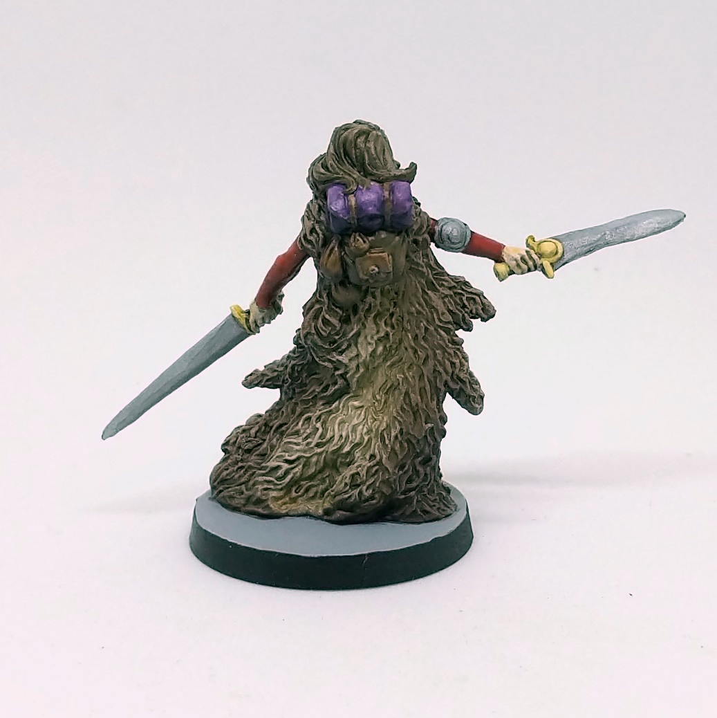 |
| Mila |
As for the painting, she was the only one that I had to strip. Yes, yes, I know, it's ironic. Trouble is, when I primed her, I noticed a seam line running down the left center side of her torso. There's no texture to hide it, but I thought that I could paint over it. After doing a fair job on the furs and a good job on the skin, the seam line was really glaring: I couldn't cover it up as I had hoped. Knowing I was doomed, I tried carving away the line, but of course this put gouges in the paint layers that were irreversible. Into the Green Stuff she went, and I re-primed her with figures from my next painting project and repainted her.
Her front is mostly flesh, and I think I did a good job of adding the highlights and blends. She reminded me of painting Lyssa from Runebound 3rd Edition, another toned bare-bellied woman where I had to imply a navel and muscle tone from a smooth surface. For Mila's cloak, my idea was to have variable colors in the hide, so I put in my base colors, added a wash for shade, and drybrushed the highlights. However, I think the result as photographed still has too much of the same tone: I was going for a light center and darker edges, but it comes out looking like broad highlights instead of color variation. It's not bad, but it's not quite what I had in mind. If I had to do it again, I would consider a different color entirely.
I've thought about just hiding Mila away somewhere since I don't like the implications it has for controlling gaze. At the same time, I wonder if I can use her to teach a lesson. We've used her a few times prior to painting, and one of the greatest abilities of her recommended class is that they can get a big boost for removing their armor. My boys and I laughed at gaining this skill, acting out ripping off armor like Hulk Hogan before charging into the fray. Seems that I'm torn between the two interpretations of the figure.
Closing Thoughts
These figures were a lot of fun to paint, although as I mentioned in my previous post, I think that's enough tattered cloaks for a while. The characters all seem to shop at Belt Pouch Outlet as well: the same visual elements show up in almost all the figures. Those are minor quibbles though for a group of characters with so much variation and style. I'm looking forward to getting Massive Darkness back on the table this weekend.

By the way, remember how happy I was in my last post about how all the pictures looked just right? Not too long after that, my Nexus 5X died in bootloop hell. Now I have a new device, and I took all of these pictures several times. The ones I've included here are the best of the bunch, but they're still not perfect. Using the default photo app, I had all kinds of trouble with consistency of pictures: the temperature of Lil' Ned and Azrael were vastly different. Doing post-processing in Snapseed didn't help the consistency problem. I ended up reinstalling OpenCamera so that I could get more manual controls. The pictures here were taken with automatic white balance turned on, ISO 100, and (I think) 1/100s shutter speed. This gave good consistent shots in my lightbox, and then I was able to adjust the white balance by picking up the background color in Snapseed. Some pictures are still slightly off, but they'll do for sharing here. I am rather disappointed that I have to go back to fiddling with these things just after my other set-up seemed to finally stabilize.
Also, I'm pretty sure I've never blogged this many words in one day before. After writing all afternoon and having dinner with the family, my wife went out, so I figured: why not do some hobby writing too?
Thanks for reading! Tune in next time when we make a genre shift to something with slightly fewer tattered robes.
No comments:
Post a Comment